Part of Digital Diplomacy
29th August 2014 London, UK
Mapping the online conversation of the Global Summit to End Sexual Violence in Conflict
Maps of the online landscape can provide fascinating insights into how they are connected and how they interact. In my last blog I looked at a few of our Ambassadors’ accounts and found some of the communities that existed amongst their followers.
This blog looks at the way maps of the online conversation can help provide insight into the FCO’s work on major campaigns, such as the Global Summit to End Sexual Violence in Conflict. The FCO engaged with the public, the NGO community, and other influential stakeholders such as media organisations, both at the summit itself and through the global relay of events organised by our posts. You can read more about how the Digital elements were integral to the Summit on Alison Daniels’ blog.
To help map these conversations we gathered over 190,000 bits of content related to Ending Sexual Violence in Conflict in the period 09 June to 13 June using a social media monitoring tool. We then worked with data scientist Dr Ali Fisher to visualise this information in different ways.
The time lapse map above shows the online conversation throughout the summit. You can see the conversation take off on 10th June when the Summit started and our embassies held events as part of the global relay.
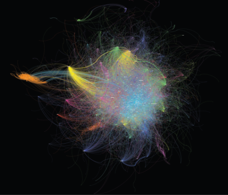
The whole conversation
This map shows the full conversation around the summit by drawing a line between any two accounts which engaged online on this issue. To make the map more readable and to focus on the most active and influential accounts we removed accounts that only engaged once.
In this map you can quickly spot key influential accounts like @UN and @UN_Women (large orange and red nodes in the central cluster).You can also see where very prominent influencers, like Pope Francis, tweeted in support of the campaign. The bright yellow star shape in the top left represents the global engagement with a tweet from @ponitfex. This single tweet was shared nearly 6000 times.
Unsurprisingly for a FCO priority like this, FCO accounts like @end_svc, @foreignoffice and our embassies are shown as highly engaged with most of the conversation, as they are in the central light blue central cluster.
If you go to the full pdf version you can zoom in and search for particular accounts.
Who were the FCO talking to?

This map shows over 5000 bits of Twitter content sent out by the FCO’s various accounts – both things they created and retweets. As this is limited to only show FCO authors, subsequent retweets by a non-FCO author are not collected. The accounts making the most connections are coloured red, with blue representing the least connected accounts. In the full pdf version the thickness of the line represents the amount of connections made between two accounts.
As we expected, this map shows that the main account @end_svc and @foreignoffice were fundamental to our communications. This clearly illustrates the way that a summit can focus attention on a campaign.
The map doesn’t tell us which FCO accounts were most effective – that would require much greater detail of analysis against the core aims of the whole campaign. However, it does show some interesting different behaviours such as the fan connected to @UKinTanzania (bottom right), it appears they reached a unique audience through the online conversation around the event they held in the High Commission in Dar Es Salem.
Where were people?
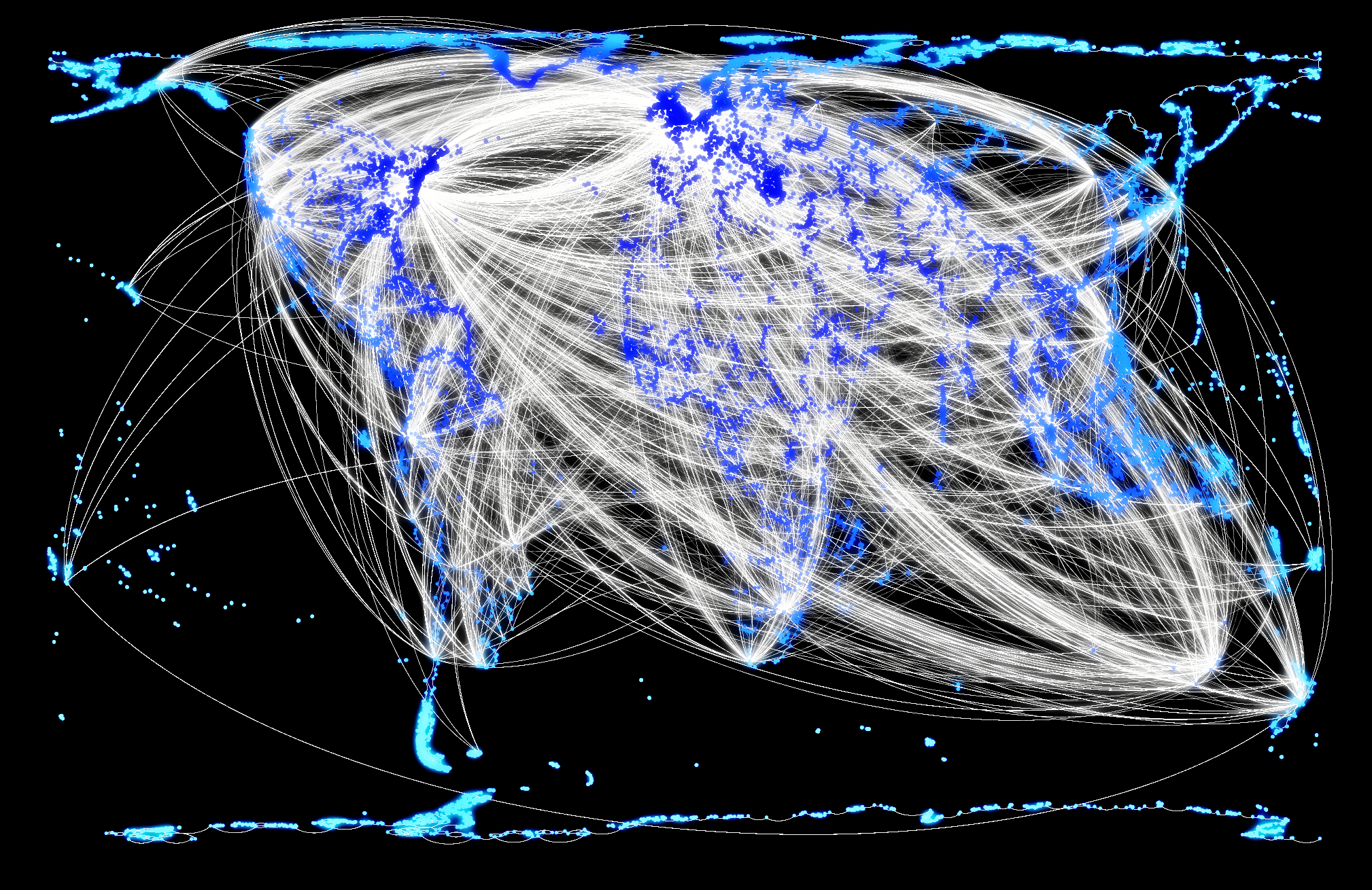
The lines on this map show all the retweets that occurred during the summit, providing a simple reflection of the online conversation (the blue dots represent land). There is a clear centre of activity in London and another key focus point on the east coast of America. However, unusually for a map of a summit, there is a definite global spread to the message which could well be attributed to the support the whole Foreign Office network gave to this campaign.
These maps clearly show how engagement with key global figures like Pope Francis can give a huge boost to our campaigns, and how our network of embassies can raise global awareness of an issue like sexual violence in conflict.
If you have any thoughts on these maps or have seen any other useful network map visualisations that you’d like to share, please leave a comment below.
Follow Toby at @butler_toby