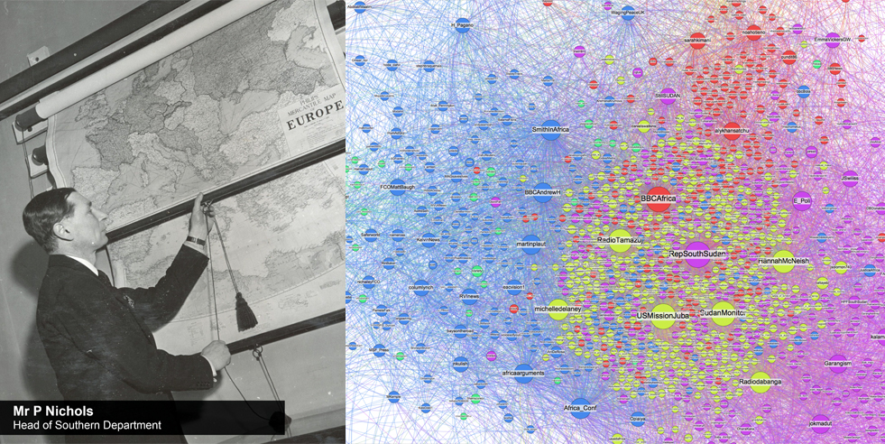
On the first floor of the Foreign Office main building, civil servants used to pull down maps from a burr walnut cabinet to pore over them and discuss the latest news from our embassies. Whilst the original maps have long ago been shipped off to The National Archives, the Foreign Office’s love of a good map remains.
We in the Digital Transformation Unit wanted to see what lessons we could learn from mapping some of our Ambassador’s social media followers. Working closely with the Government Digital Service (GDS) we presented a few of our Ambassadors and Consuls General with those maps at the recent FCO Leadership Conference.
We selected Twitter accounts which had different geographic spreads of followers, ranging from those with most followers in the UK to those with most followers in the host country. Given the constraints of Twitter’s Application Program Interface (API) we choose accounts with less than 5000 followers.
Dan Collins in GDS then did the techie work and you can see his full write up on his blog. My quick summary was that he first gathered the data by reusing and adapting some Python code (available here on github). He then used Gephi to graphically represent the influence of follower accounts and the different follower communities (represented by different colour groupings). The groupings work well as a rule of thumb – but can’t be taken too much further.
These maps were the end result and provided our Ambassadors with a visual indication of their followers, who was connected to whom, followers who were particularly influential, and where online communities existed.
The feedback from our colleagues has been great, with the maps allowing them to better understand their followers. It turns out they do still love a good map.
The sample size for our trial has been small so we haven’t been able to draw anything like the kind of conclusions that the Pew report on Mapping Twitter Topic Networks has. We would be really interested to hear if anyone else has started looking at trends in follower’s behaviour.

Each map is interesting. Chris Trott, the Consul General based in Cape Town, works to promote British political, commercial, scientific and security interests in the region. This is mirrored by the three different, mainly South African, groups in the map of his account. The red appears to show a political cluster, the pink and purple a community largely focused on industrial and environmental community issues, and those in green the core of the South African Twitterati, such as Cape Town blogging sites. You can also see very clearly the separate community of FCO accounts that exist – we hold a twitter list here.

The UK in Holy See account map also seems to show how real world locations can influence the shape of an online community (although there could be other factors too). From analysing a sample of the twitter accounts that exist in each community, you can see they all have an interest in religion and politics but that it is the location of each of the groups that changes the most: those in green are largely Rome based; blue shows International and US followers, and purple and yellow UK based followers. There is also a clear cluster of important NGOs with a strong interest in human rights in the centre of this map. Knowing this means that the team can ensure they send messages that are relevant to this audience.
These maps have given us some interesting insights into the communities of online followers that our accounts are engaged with around the world. We’d welcome your comments and analysis on this work and these maps as well. You can also see on the gov.uk performance prototypes pages the other fantastic work that GDS have been doing to present Government data.
Thanks. Do let us know how you get on, it would be great to share findings.
Fascinating. I look forward to try and do similar mapping with Danish diplomats and representations.