4th December 2015 London, UK
Assessments, users needs and the design of everyday things
I’ve recently been through an assessment for the legalisation service. Preparing for an assessment is no trivial task, and it’s fair to say at times you spend all day thinking about it, you go to bed thinking about it, you wake up in the night thinking about it, and when you wake up in the morning you’re still thinking about it. Have we covered all the questions on user research? What’s the the best way to explain our approach to the team? How shall we run the demo? The mind whirrs and before you know it you’re applying the standard to the world around you.
It was on one such sleepless night that the quirks and characteristics of the cubicles in a particular changing room started to bother me. Perhaps the ghost of the design of everyday things, read many years ago, was haunting me. Maybe I’m getting too obsessed with user needs. Regardless, let’s take a look.
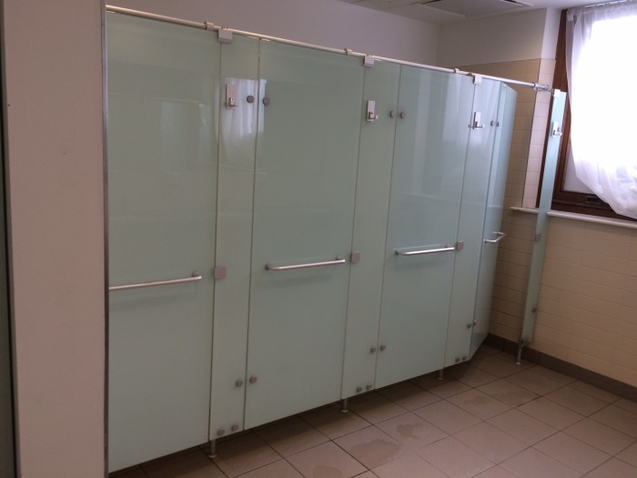
Here they are, three identical cubicles:

Smart eh? Did you notice the hook outside? Very handy for hanging a towel on, out of reach of water but within reach of hands. That works. Well designed. Protected from splashes but no awkward journey to a rail over by the sinks. Privacy maintained.
Now let’s take a look at this second hook on the inside of the cubicle:
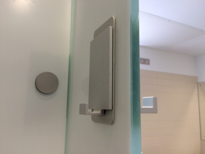
This hook is clearly not designed for a towel. Of course you’re welcome to try putting your towel there (perhaps on your first visit) but you’ll soon figure out that the one on the other side of the door is best for that. No, this hook is for soap, shampoo or shower gel. None of which, last time I looked, come in packages which work well with hooks. Yes, if you really want to you can get soap on a rope, or you may be lucky to have picked up a gel with a retractable plastic clasp, but it’s not the norm. Believe me, I’ve checked – I can confirm that not one of the gels in this picture offers a built-in clip, hook or clasp:

So what? Well, my gel keeps falling off whenever I try to balance it on the hook. So the designer of this shower is telling me that to use this hook I need to buy a particular kind of soap or gel. That’s like a web site saying you need a Mac, not a PC, to be able to use it. In digital terms this is about failing to make the service accessible to all users.
And more fundamentally, perhaps, the designer didn’t start with user needs, or perhaps do much research up front – which surely would have indicated that a tray of some sort, with drainage holes, would have been a better user experience as many different products could be stood on it.
But does it matter, what’s the impact? Or, to put it another way, can’t people just get on with it and stop grumbling? Well, at the beginning I told you there were 3 identical cubicles. Not strictly true. Let’s look at that picture again:
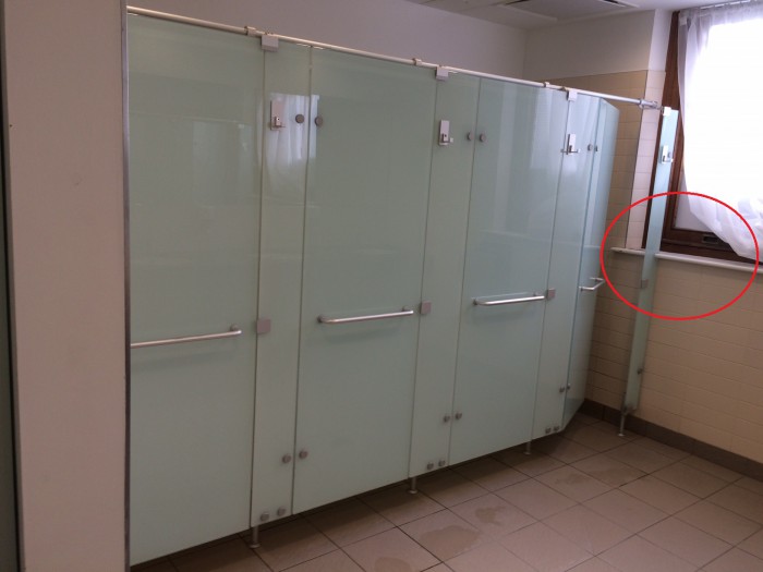
Wait a minute, there’s a window sill over there! And wouldn’t that be just a perfect place to stand my shower gel or shampoo, sans hook! So what have we here, and what does this have to do with online services? Allow me to scratch my chin and shoehorn in several points.
Firstly, context: the cubicles are strictly identical in their parts, but the context for the far one differs from the others as it’s next to a window sill. A different context can mean it is used differently (and preferentially, by those in the know, as you will shortly see). Just as an expat may use one of our online services differently to a traveller.
Secondly: workarounds. Guess what? If you don’t give users what they want they will get creative and try to find workarounds, which may have knock-on effects. And you may be inadvertently encouraging some of this through what designers would call affordance, which is a posh way to say if it looks like a shelf I’ll use it as a shelf, thank you very much:

Which takes us back to the “So what?” question. All that water dripping down the side of bottles and collecting in a puddle is ruining your paintwork! Do these savages have no respect? Now you’re going to have to get it re-painted, only for the cycle to repeat. And what’s more, the wood may be rotting away. That’s going to cost. If only you hadn’t been too busy for a bit of up front research and testing. The initial investment usually pays off in the long run.
And while we’re at it, how come no-one alerted you to this earlier, before the damage was done? If this were a web site, Google Analytics or Piwik tracking might have alerted you to an unexpected user journey and the use of the window sill. It would allow you to see the footprints of users on the site. Well, as luck would have it (especially for someone squeezing the last drop out of an analogy), as this is a changing room it has footprints too!
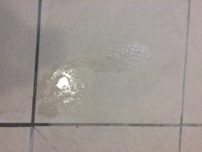
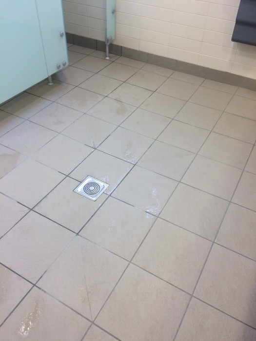
Transient ones, but enough to tell any observer that the most common footprints do not in fact lead to the middle cubicle, as might be expected given it is the straightest line from the entrance. No, only the newcomers use that path. The regular, heavy users are all heading to and from that far cubicle – the one furthest away, but most convenient to use overall, thanks to that handy window-sill-cum-gel-shelf:
This evidence was likely there in the footprints from the very start. For similar reasons, in Finland planners are reputed to visit parks immediately after the first snowfall to understand how they are being used.
So there you have it – a changing room pot pourri of user needs, research, data, user-centred design and desire paths, or put simply: what keeps me awake at night.
Follow Mark at @markbarlow
Yes, repainting might be costly in this case, but there are other options to be considered along with it. Placing a side panel with a hanger (again) maybe will minimize the rooting damages. After all… these are the cons of the shared bathrooms – you can’t get the convenience you have at home.
“If you don’t give users what they want they will get creative and try to find workarounds” I couldn’t say it better! From my job as a handyman, I saw many workaround projects that I was called to fix. Believe me, it could have been worse. My experience showed me that the usage is in first place for the clients (users), except those people who prefer the style. This is why it is best to think about the usage needs, before starting a project.
Brilliant comms piece. Well done Mark!
Brilliant – thanks Mark – a perfect representation of what we are trying to do in understanding how people are – and want to – use our services.
But if you’re the owner of the building and just outside the shower cubicle you have a stand selling these http://www.amazon.co.uk/Luxury-Elegance-Natural-Skin-Care/dp/B001HNGAI0/ref=sr_1_289?s=beauty&ie=UTF8&qid=1453452586&sr=1-289-spons&keywords=shower+gel&psc=1 then you’re onto a winner, you’re the new Apple, selling devices that lock the user into your own range of add-ons
I might not be the ultimate handyman in the company, but I could say I’m a conscientious one and for my few years of experience I’ve managed to go through almost all types of home improvement handyman services I’ve had to learn that even a simple but still poor bathroom installation and design might cost it’s owner way more nervers that I would never assume if I myself didn’t had to deal with such. To be honest, most of the carpenter jobs and odd jobs in general have had something to do with somebody’s poor understanding of design and usability, which could have saved my both nevers and time.. Of course, do not get me wrong, that’s a substantial part of our job as handymen, but for sake what you’ve written I had to say it.
Kind regards,
Dmitri
Reminds me of http://www.annashipman.co.uk/jfdi/roof-bug-fixing.html truly lateral.